Bethany
Neighborhood

I decided to choose this picture because it is where I used to live at the ending of my elementary school days. This neighborhood is called Park Slope and is located in Brooklyn and these sort of houses are called "brownstones." This is my ideal neighborhood because it has so many things to offer. In my opinion, a community is the people and places that are in a neighborhood.. The vibe that this place brings is so calming and soothing and very antique. You see the most beautiful sights such as children on their scooter headed home with their nanny and people eating on terraces constantly and stoop sales selling the most vintage findings. When I used to live here I would walk my dog and people coming home from work that I wouldn't know at all, would say hi to me randomly. People are so friendly in this neighborhood and very open-minded. There's a lot of farmers markets that go on the weekend and I always used to go and get the freshest fruits and chocolate. There's also a lot of little boutiques and the area is also packed with people walking to restaurants where majority of them eat outside. It's just really nice to see how calm people are and it's the total opposite of being in the city.
Mental Mapping
 I live in Springfield Gardens, Queens.
This is my first time using the method mental mapping and I found it quite interesting. What I took from using the tactic mental mapping is that you can dig deeper into something that's either personally drawn or cut and glued based on memory of your neighborhood. Seeing a map without the artist explaining it to me is so much different from them explaining it to me not exactly how it's shown on the map because these people would include memories and how they feel when they go to these places. I got the honor to be in a group with very different people coming from very different places so it was interesting hearing their input. At first I was curious on how this concept was going to help else at all. I just figured we were just drawing our neighborhoods and Ms. Bellino will think something up to talk about it. I always knew that everyone lived differently but didn't think you could take out some things of the map and over analyze it to make it more than what it looks like. When discussing with my group members about there living conditions, they answered all of my questions I had thought of. If I were to share my research with anybody, it would have to be my mom. She is a very understanding and smart woman and if I ever shared this information with her and how other people see my neighborhood, she would most likely think differently about it. We never really put that much attention into the area that we lived in so I know it would be an eye opener for her. The way i would share my research with her is to let her listen to the audio data we recorded and while she listened to it, let her look at the pictures of all the maps.
Now that I understand the concept of mental mapping, I'm more open to it. At first I was hesitant considering the fact I didn't know what to do and how it worked but now that I got the hang of it and understand what I can get out of it, I'm more appreciative of it. I think the tactic of recording our conversations was really helpful because a lot of us forgot thee key topics we brought up with one another, so listening back to them was a refresher and was helpful when writing more notes. We had a great turnout with the whole process so honestly we didn't have any flaws. Another way I think we could capture one another's homes is having each person take pictures while doing a neighborhood walk to give the spectators more insight on our homes.
Now that I understand the concept of mental mapping, I'm more open to it. At first I was hesitant considering the fact I didn't know what to do and how it worked but now that I got the hang of it and understand what I can get out of it, I'm more appreciative of it. I think the tactic of recording our conversations was really helpful because a lot of us forgot thee key topics we brought up with one another, so listening back to them was a refresher and was helpful when writing more notes. We had a great turnout with the whole process so honestly we didn't have any flaws. Another way I think we could capture one another's homes is having each person take pictures while doing a neighborhood walk to give the spectators more insight on our homes.
Advertisements
Adbusters
Methodology
Collecting Data
The way I collected my data was that I walked around my neighborhood looking for advertisements. Because my neighborhood is a very suburban area, it was hard finding advertisements, so most of my advertisements were in Manhattan and on the LIRR (Long Island Railroad.)
Content Analysis
While observing all of the advertisements I collected, I realized that most of the ads had things written on them that had nothing to do with selling the product or service. I also observed the different tactics these ad creators used and some of them were big font, small font, colorful font, beautiful but unrealistic colored scenery, and beautiful or sometimes (purposely) ugly models. They use this tactic to lure in their customers. Their first intention is to get their attention and when they do, the customer will read more into the ad. The creators also leave them with a little bit of curiosity making the customer want to look up the brand/product/service on their own. I was picking up on these tricks while I was taking multiple pictures in multiple places. Most of the ads had to do with money, luxuries and body image. The one that really shocked me the most was body image. Not only were there a countless number of ads piling into this one category but these photographers are not stupid. They take the picture at a certain angle with certain props in a certain background. The concept of the perfect body were portrayed many times in my findings of ads and there isn't actually people that look like these made up models. The reason why I describe them to be made up is because they look nothing look humans, they look like plastic dolls and that's when i agree with Cameron Russell 100% that the pictures of models that they take are not of models, but of their constructions.
Critical Analysis
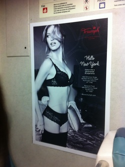
This is the advertisement I wanted to pick which was under multiple categories: luxury, money, sexism, beauty and body image. I found this advertisement on the LIRR (Long Island Railroad) when I was taking it to go to school. The first thing that caught my eye about this ad was that the woman was barely clothed. The photographer was definitly going for the sexy look and you can tell by just looking at the ad. She's wearing a bra, underwear and thigh high stockings. Her hair is tousled and she's kneeling on a bed but the picture is taken at an angle where it shows that no one is joining her in the bed so I guess the viewer (more likely a man) it supposed to imagine them being next to her. Another thing was that when I looked at this ad, I didn't recognize the brand. So I looked it up. Not only is it an expensive line of lingerie but it derives from the UK and it's only sold online and can only be bought in Euros. So no Americans can even buy from this website considering that's not the currency we use.
Findings
Findings
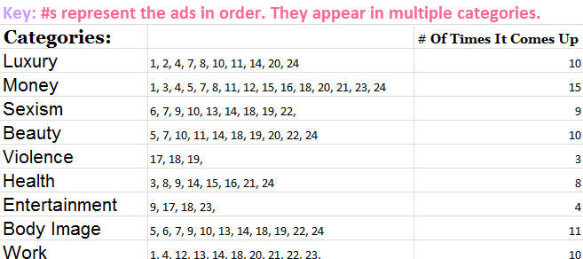
Table 1

Chart 1
*** EACH SECTION IS THE PERCENTAGE OUT OF 100***
On Table 1, I came up with nine categories that you see above. The way I came up with these categories was on how I thought the ads portrayed some of their aspects. Because I felt like most of the ads had more than one categories in them, I put the ads in multiple categories. That's why you see a bunch of multiple numbers. I numbered the advertisements in number order, based on their appearance on the slideshow.
On Chart 1, I sort of did it in a complicated manner. Each category is individually calculated where the percentage out of 100 pertains to only that section at a time. For example, in the category luxury, 40% of all ads (100%) have an aspect of luxury in them. I wanted to divide each section individually because I wanted my readers to focus on what these ads are truly consumed of.
Discussion
I actually loved doing this project because it was an eye opener for me. Yes, I'm one of those people who will deny that they are not in any way possible rendered because of ads and doing research and watching a ton of inspiring videos has made me realize that I actually am growing up around all these negative messages through posters EVERYWHERE. Not only can we not run away from them, but when we try to ignore them, we just can't. They're a big part of what it's like to develop considering the fact we are introduced to TV as such a young age where we can't escape such influential commercials that have no filter. This project has really shaped me into being so gullible with all the messages around me that were "hidden" and now present. Some of these ads really challenged my views on some of my favorite brands that it's given me a different perspective on how I see them. One thing I just have to put in here is that I have been a subscriber to Glamour magazines for a little bit over two years now and a few months ago, they have come clean in one of their monthly magazines about photo-shopping the models to make them thinner and make their features more defined or in some cases faded etc. They have made a pledge to not do it anymore. They also said they only use photo-shopping for strands of hair sticking out or wrinkles in the clothing and some other stuff. Even though that's a change in one magazine I read out of five, it is still something. I think Glamour is sending a powerful message to all magazine brands to not abuse the advantages we have in world to make things a disadvantage when it stemmed from a good thing. We are only human and real beauty beats out "constructions."
